View from Space: Has rustic gone rusty?
Unearthing the latest natural design trends in food packaging.
When we think of natural and organic food packaging we might conjure up images of earthy materials such as craft paper and garden string. Combine that with stamp effect typography that feels like it’s been applied by a five year old armed with a painted potato and wobbly illustrations of wheelbarrows and plants and hey presto, a look that screams “No nasties - honest.”
For over a decade it has been the go to design formula to signpost consumers toward a supposedly more ethical product, but has this approach finally had it’s day?

Young people today have never been more aware of the negative impact of adulterated foods, and the importance of gut and mind health. In fact, a special term has even been coined to define these people: ‘wellthies’. All of this has been compounded further by the rise of ‘mood foods’ which can constitute certain fresh fruit, veg and fermented foods with not a single E number in sight.
Here at The Space Creative we think change is afoot in the packaging world. Forward thinking brands are no longer relying on the ‘rustic’ approach to communicate their holier than thou credentials for on-shelf success. What we’re starting to see now is practically the polar opposite - bright ‘screen inspired’ colours, synthetic graphics, abstract patterns and clean, slick typography without a potato wielding infant in sight. Why is this? There could be more than one theory…
Is there now a higher expectation among consumers who at certain price points think organic and natural credentials are a given? With regards to health claims on the front of pack we are seeing a move towards ‘essentialism’ - listing the bare minimum. One or two claims at best. Too many and the shoppers become sceptical and won’t read past the clutter.


Another theory might be that with the onset of pinterest and instagram, consumers are much more design literate and associate high design aesthetics with good quality ingredients and sound credentials. And if a pack is not sexy enough to be instagramable, you might as well get your coat.
And then there’s the ‘new nature’ trend. The idea that nature alone is not enough, it’s all about the benefits of science AND nature with brands such as The Food Doctor and Savsé. Now a lot of already healthy, natural products are also fortified with beneficial additions like ginseng, protein or collagen. These often inspire a more clinical and technical approach to design, communicating their scientific take on natural food.
Of course it would be naive to reject what is often the trigger at the heart of a new fashion - boredom. Creating a new piece of packaging that looks like everything that’s gone before obviously won’t excite shoppers. There’s the insatiable demand for the new to appease. The eco-luxe movement has been a response to this and taken natural materials to a whole new level with uber minimal compositions, clean typography and a mathematical approach to natural materials. It’s become a mainstay of luxury organic brands, especially in the beauty sector. Tapped have drawn influence from this beautifully with their pure birch water packaging.

Brands are also finding other ways to communicate their natural credentials. There’s a big movement towards transparent packaging, highlighting the product inside so you can see the yummy goodness for yourself.
Another inpacting factor is how brands are embracing colour. Rather than sticking to one ‘brand’ colour they are embracing the ‘rainbow effect’ - choosing a boldly different colour per variant to make it easier for shoppers to navigate their ranges.
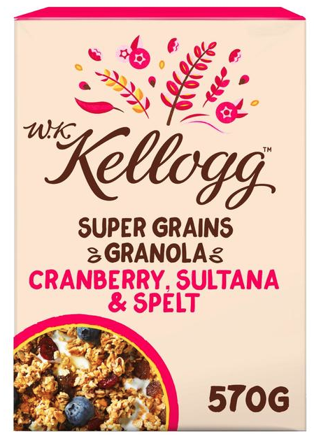
The big multi-nationals are the slowest at embracing these changes, with botanical illustrations and rustic typefaces aplenty. Even Kellogg’s new health conscious sub brand ‘W.K. Kellogg’ feels like it’s borrowing design cues from a few years back. This could also be reflective of their more mature audiences as younger consumers reject corporate brands on ethical grounds, plumping for new challengers with the added social cache of being ‘in the know’ - discovering something new, cool and of course instagramable. And it’s hard to ignore socio-economics. The less educated people are, the less likely they’ll interrogate a brands credentials and change their shopping behaviour, preferring to stick with the established names.
So how do we feel about this new disruptive approach in the natural and organic sector? We think it’s exciting, allowing us to break free from rigid design principles, crafting a look that’s more distinctive and in-tune with the brand’s personality and the consumers they serve. It’s got to be about fitting in with people’s lifestlyes and less about ‘this will be good for you’. We predict it will continue to grow until it’s flooded the mainstream. And if unadulterated ingredients are becoming an expectation rather than a luxury, that can only be a good thing, encouraging brands to be more ethical.

As a screen saturated civilisation we’ll likely crave more and more offline experiences, which means nature will be here to stay as a key antidote - albeit taken to an exciting new level, with more artistry, imagination and a lot less naivity.
But this new, raw and energetic approach won’t work for everyone. Different consumer groups are at different stages on the natural / organic journey and it’s crucial that it’s understood before reaching for that RGB colour palette.