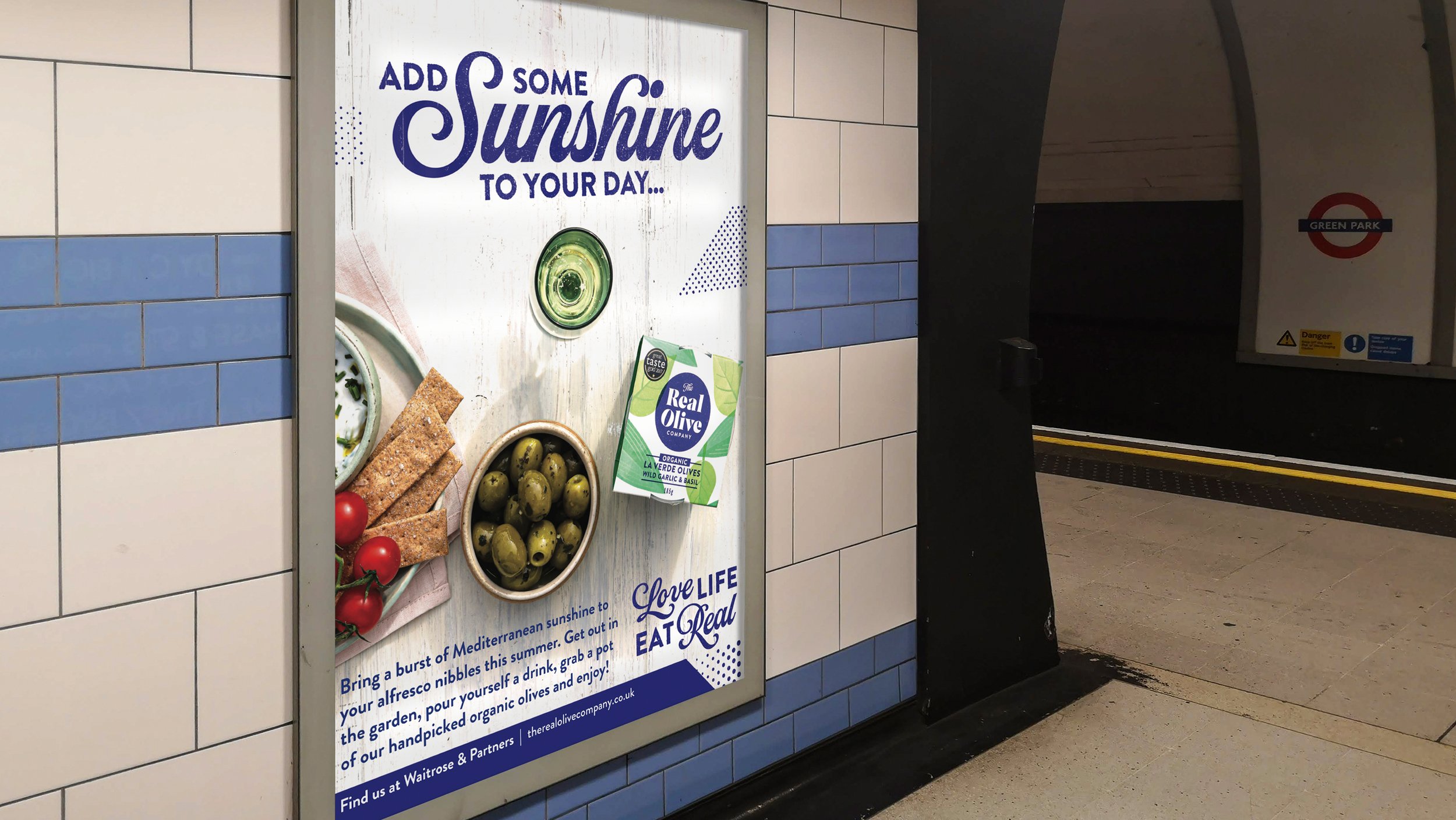
Bringing a burst of Mediterranean sunshine to discerning foodies, achieving listings in major multiples.
Brand Strategy | Branding | Communications | Illustration | Packaging Design
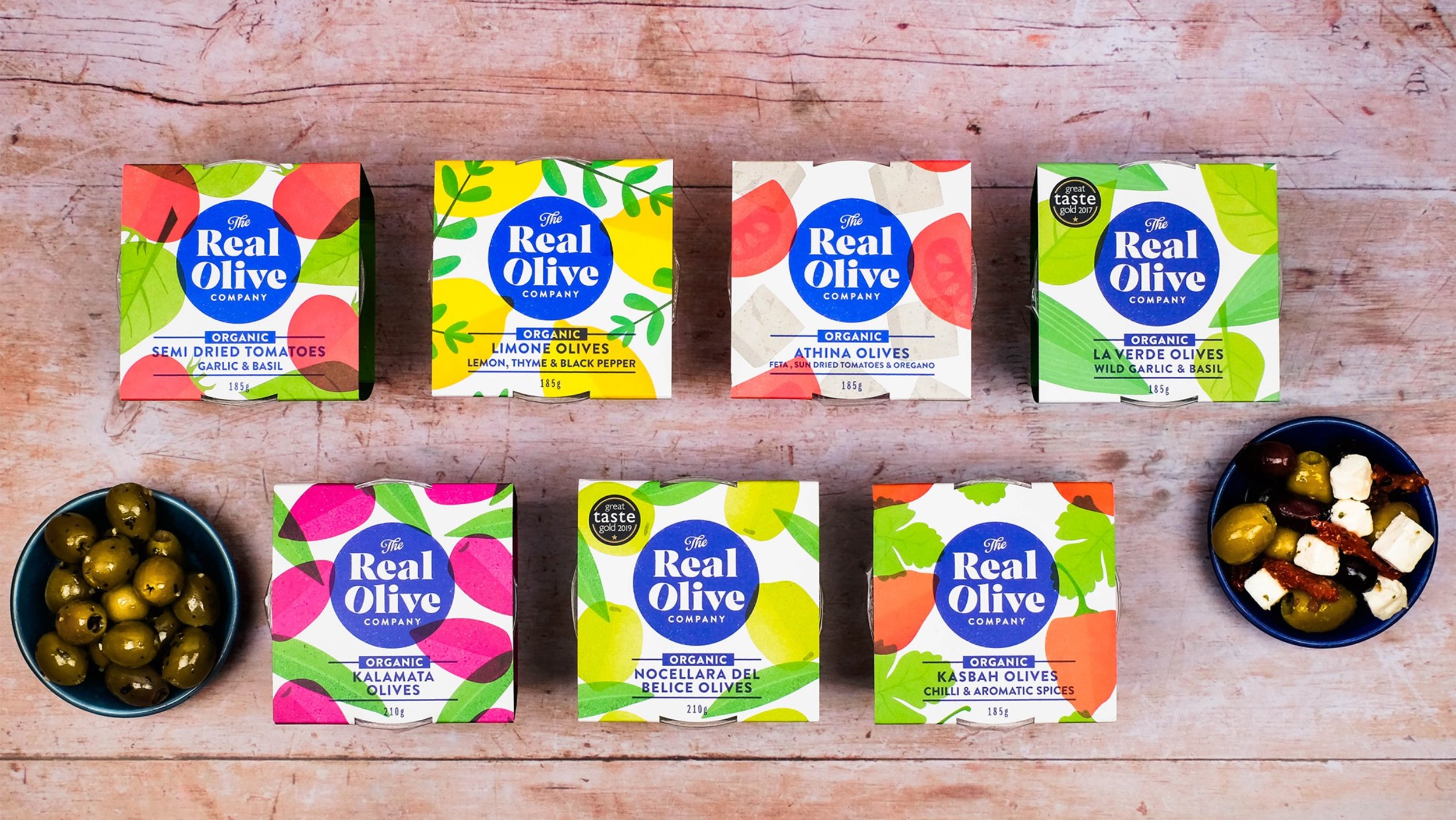
The Real Olive Company was founded in Bristol by Karin Andersson and Ben Flight in 1998. Having long been fans of their delicious olives we were delighted when they approached us in 2019 to help them redefine their brand and open the door to wider distribution and increased sales. The olive fixture is typically an own label affair and we spotted an opportunity for The Real Olive Company to stand out in a sea of plastic pots by drawing inspiration from the vibrant colours of the sun soaked Mediterranean.
Not only did we carry out a detailed strategic brand review to define their brand proposition and personality, but we also helped to sharpen their focus to attract a more discerning foodie audience who are seeking ‘good’ brands – expert producers with sustainable business practices.
“The rebranding journey was a true pleasure and The Space has really captured the very essence of The Real Olive Company.”
— Karin Andersson, Co-Founder, The Real Olive Company
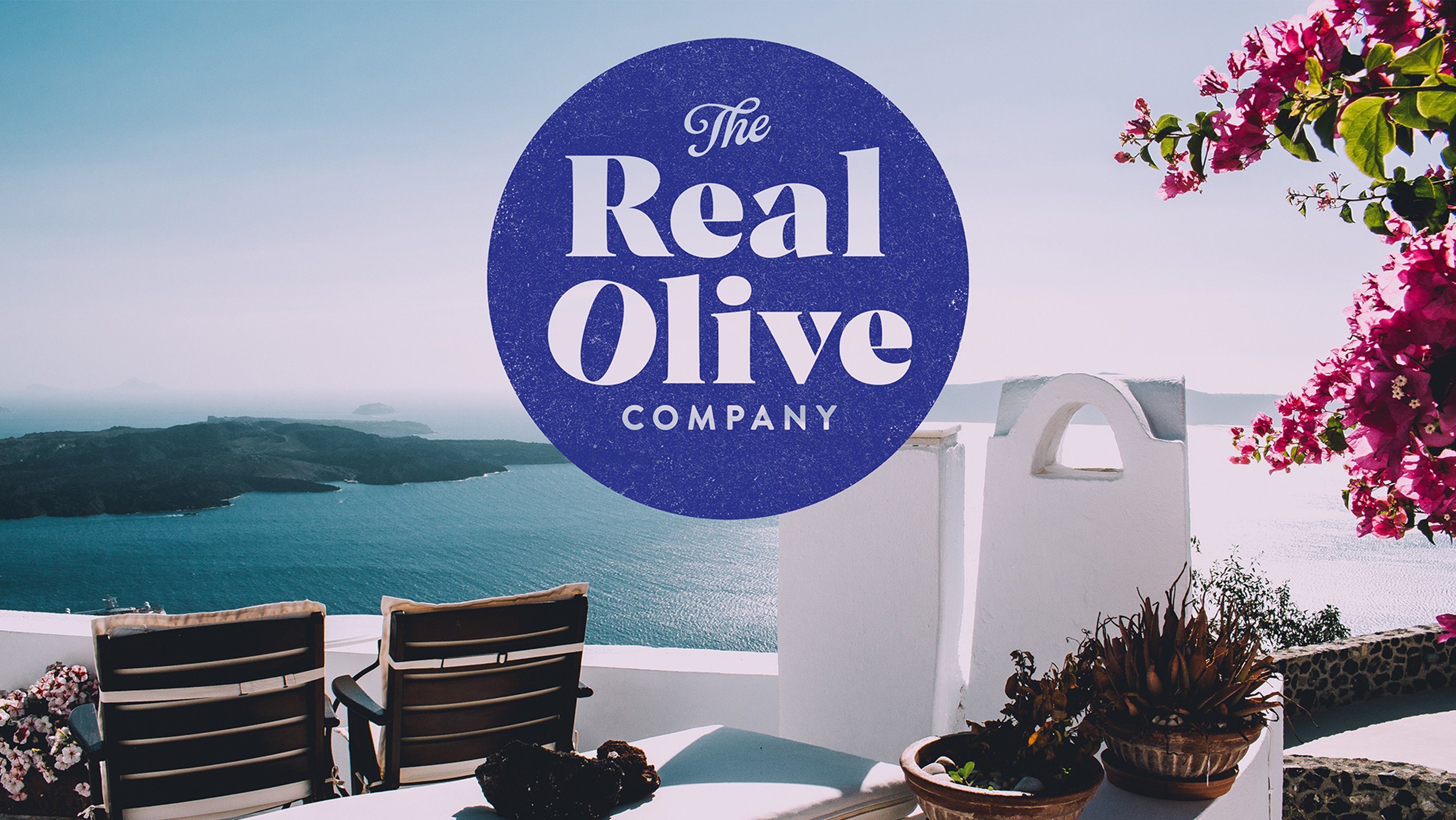
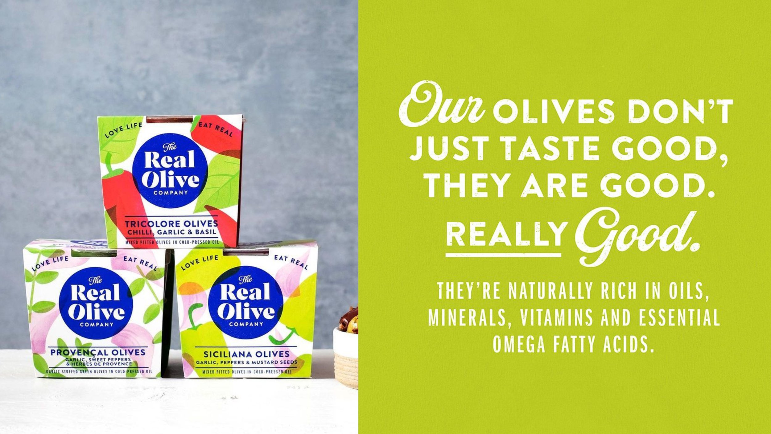
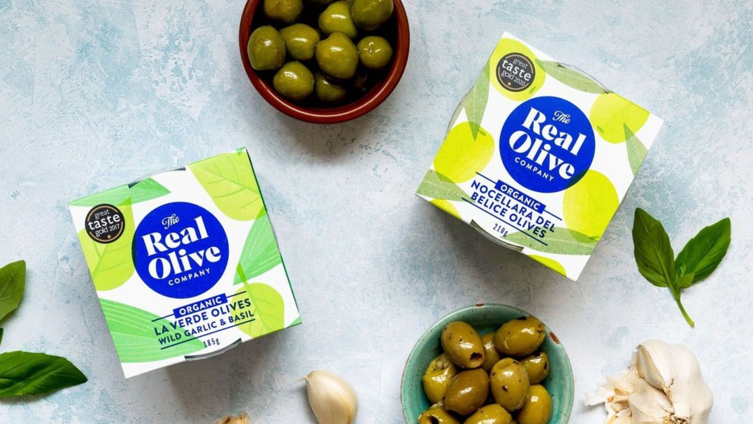
The result is a striking design solution which positions Real Olive as a premium producer of the highest quality olives and antipasti with roots at the very heart of the Olive grove. The blue ink stamped brand mark and crafted typography overlaid on hand drawn risoprint illustrations, all produced in-house by The Space, evocatively hints at the olives’ Mediterranean provenance.
Our packaging design harks back to old travel documents, with various stamps and labels. The iconic brand mark has been designed from the outset to work equally well online as well as on pack. The bold navy blue colour echoes the colours found in Mediterranean architecture and the deep blue skies and seas of sunnier shores.